Specifications :
Creation of an infographic with the aim of presenting a video game.
The product should highlight the main features of the game, such as the logo, summary, game genre, platform, price, strengths, etc. The goal is to be able to understand a game's art direction and to convey it as accurately as possible while adhering to certain specifications.
This task is designed to learn how to present a game in order to be able to do it later with your own games
The game :
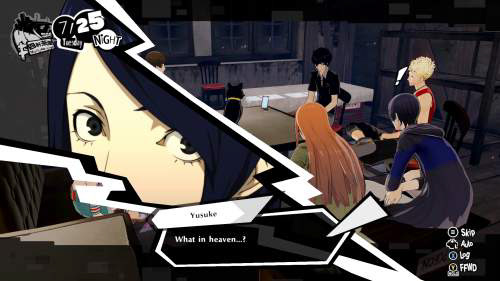
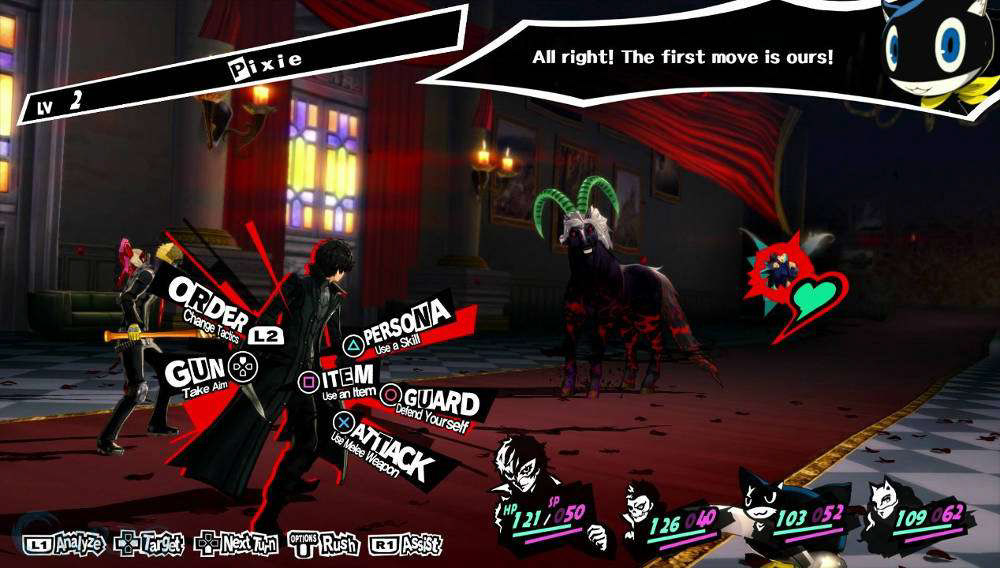
I chose the game Persona 5 because of its strong art direction and iconic UI.
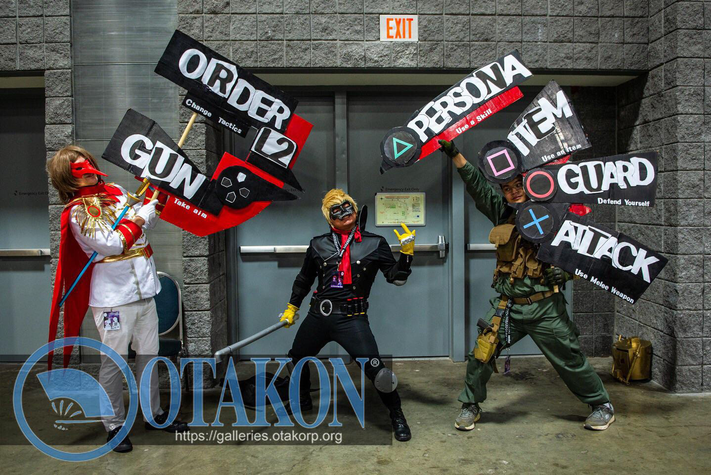
I attended a presentation about UI design by Jeremy Trilles in September 2023, and he explained the strength of Persona 5's UI. Some fans of the game even cosplay as the UI, and I think I've never heard that for any other game.
Persona 5 not only has a strong UI, but its entire art direction is robust and well-defined.


Step 1 - Analysis :
The first step was to understand what the game is about, its ambiance, and gameplay. The output from this initial step was an analytic board summarizing the artistic direction of the game.
Step 2 - Plan:
The second step was to choose how to present the different elements of the game.
The plan had to respect the common direction of reading (left to right and top to bottom), and the emphasis should be placed on the most important elements.
The idea here was to split the poster into two parts, with the first one introducing the game and presenting its general elements. The second part gives more details about the actual gameplay of the game and shows the strong distinction between the two gameplay phases: being a student during the day and exploring dungeons during the night.
The output from this second step was a plan board to follow for the final version.
Step 3 - Final poster:
The final step was to transform the plan into a beautiful representation of the game.
The upper part, presenting the game, is strong and appealing, reusing the iconic and unstructured UI from the original game.
Since the game has a strong artistic direction, the logo also holds a significant place, with the main character in the background.
The upper part, presenting the game, is strong and appealing, reusing the iconic and unstructured UI from the original game.
Since the game has a strong artistic direction, the logo also holds a significant place, with the main character in the background.
For the lower part, the elements from the plan were retained but restructured to better respect the reading direction.
The distinction between the two gameplay phases is represented by the darker color on the right part, the two images of the main character back to back, and the negative effect on the colors on the right.
The distinction between the two gameplay phases is represented by the darker color on the right part, the two images of the main character back to back, and the negative effect on the colors on the right.
The output from this final step is a poster that can be presented digitally or on paper
Conclusion :
I believe that the final product effectively meets the specifications and serves as a good infographic of Persona 5's artistic direction. I am proud of this outcome, and this project will assist in presenting my future games, which is crucial for making an impression on investors, producers, or even players.
Possible improvements:
The main character could be facing to the right since, in graphic design, the left often represents the past and the right symbolizes the future.